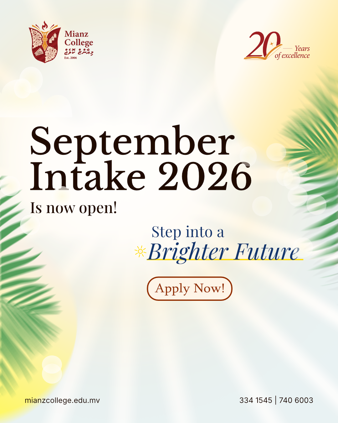
Mianz College September Intake 2026
Overview
As it was my last semester as the graphic designer for Mianz College, it was important that the design for September intake to be pushed beyond what has been made before. September Intake needed a new style to differentiate itself from the rest of the intake campaigns.
Initial Designs
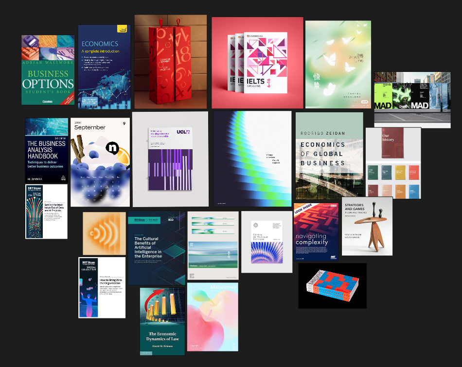
For the initial design, I wanted something that looked modern and fresh, but still grounded in education. Hence I was inspired by the book cover layout designs. I ended up with with the following moodboard.
Which resulted in the following designs
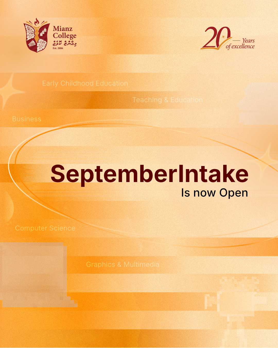
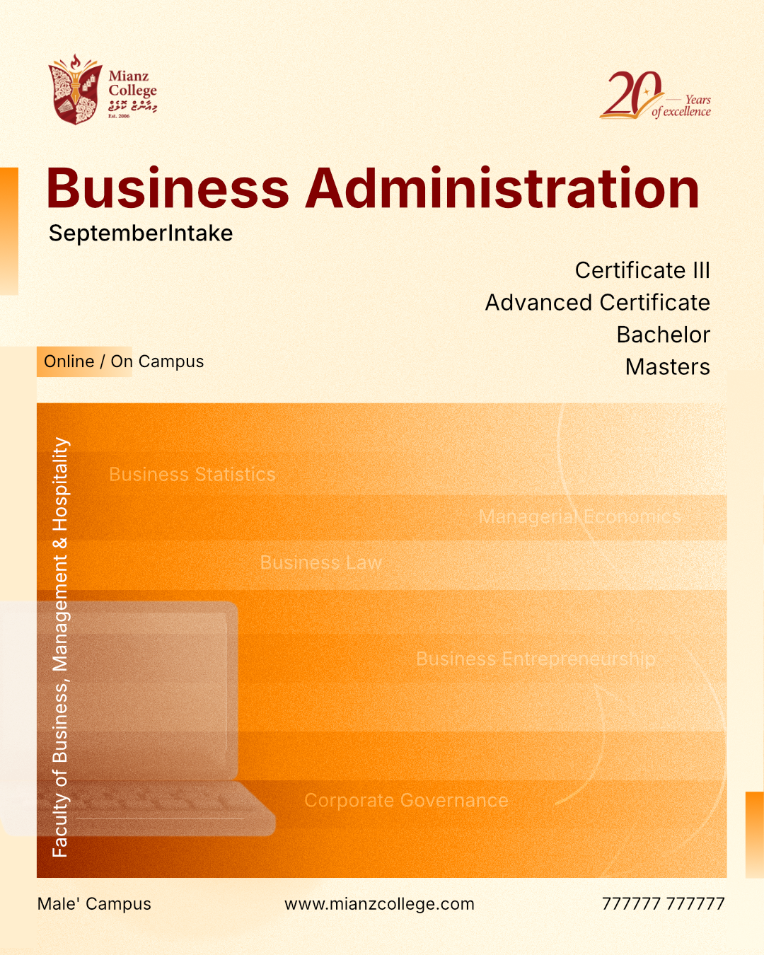
I felt pretty good with these designs as it still, very much, felt like a part Mianz College. It was less illustration heavy unlike the previous intake. The current design also had a layout that could work for 19 different posts, and also simple enough to be animated.
However the management wanted something more "brighter" and I got the instructions to create something that feels like the "sunny side of Maldives". Which I took as a fun little challenge.
Outcome
So I created the reference board
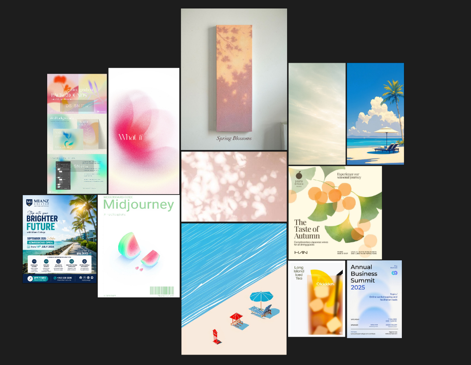
Which led to the following designs

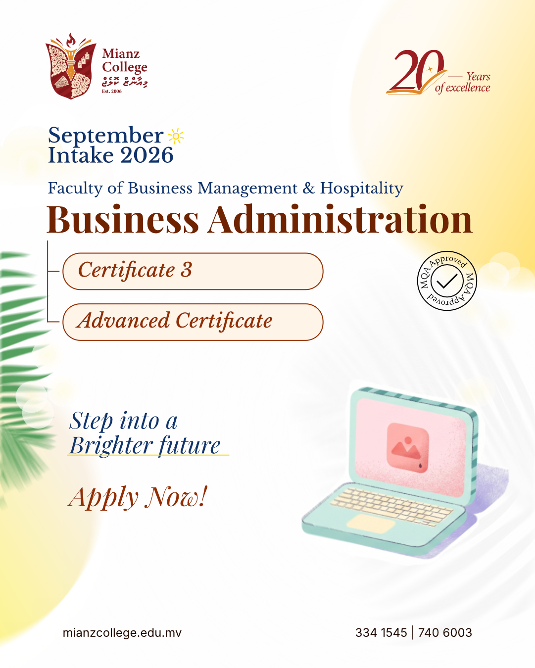

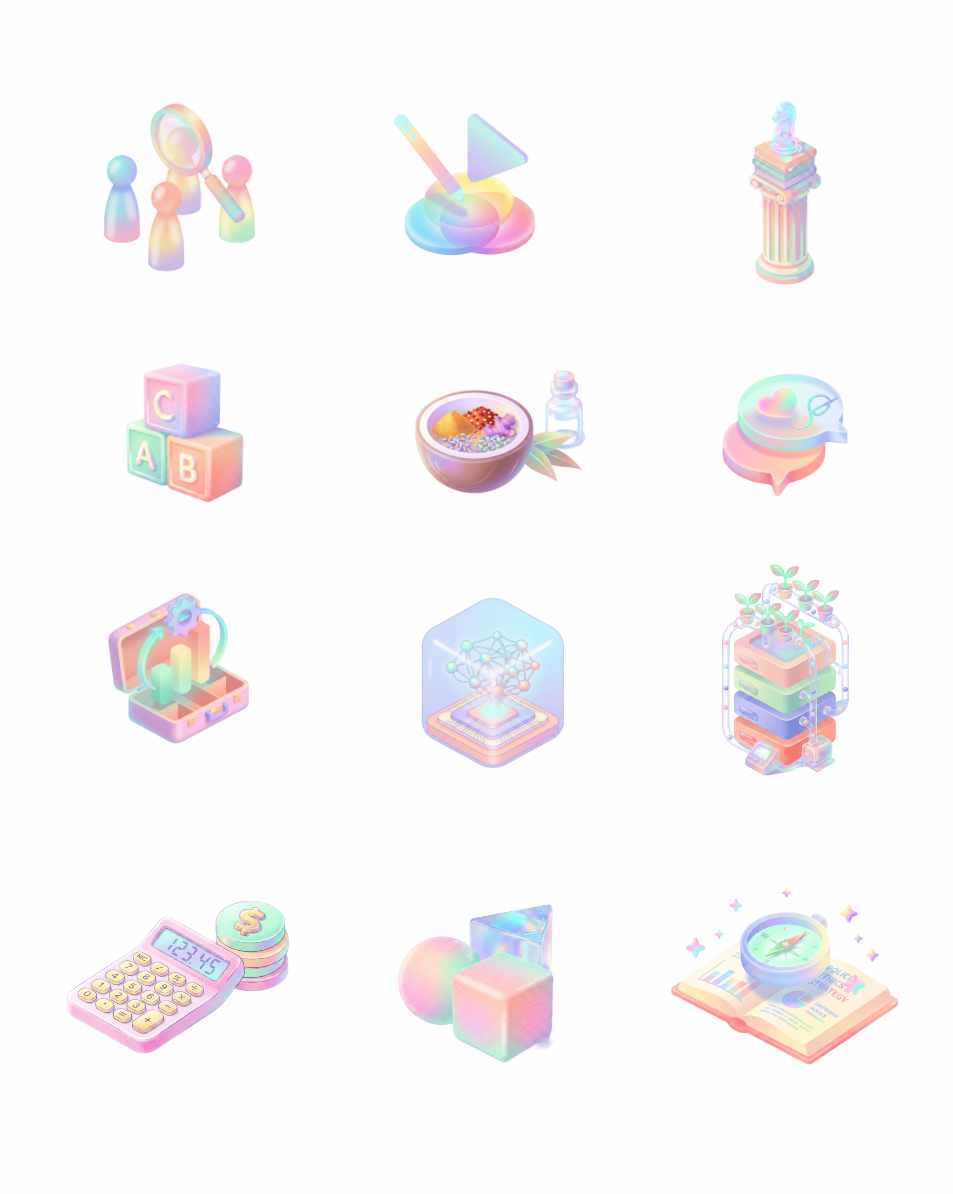
But now I have ended up with a design that used illustrations again. And marketing wanted to push out up 19 different posts. Creating 19 different illustrations at the quality I wanted was unfortunately impossible with the little timeframe. I had to create an AI workflow that would generate the illustrations in the style that that was needed.
And for that I experimented with figma Weave.
Figma Weave
Figma weave only had a very small learning curve. Maybe I did not use it to what it really is capable of. Either way this workflow proved to be simpler than generating assets using the small chat window.
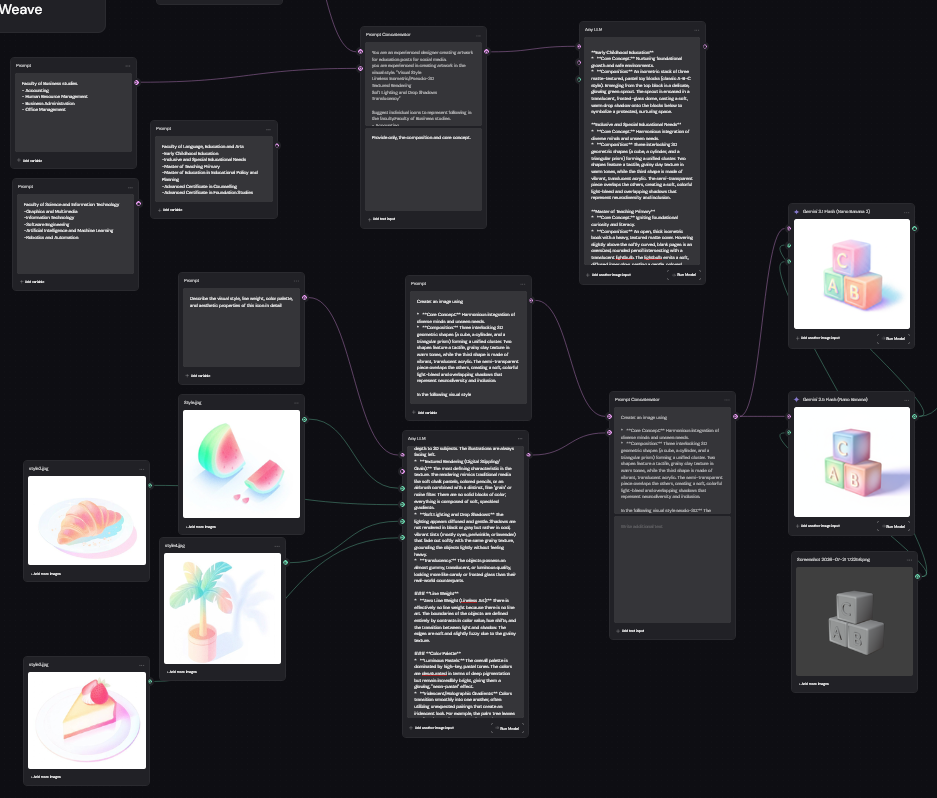
The results were pretty good. It was obviously not perfect, even with explicit instructions some of the assets came out with slight variations in style which would would not exist if illustrated by a human.
Conclusion
Though I would have loved to see my initial design in to the end, I think the branding for September intake came out pretty great. What I found really interesting, is how the simple direction "sunny side of Maldives" created truly unique design, spcecially when compared to the designs in the educational field. This "tropical" designs obviously feels like as if it belongs in the tourism sector. But maybe it is these simple directions, juxtaposed with the companies branding, that make a brand truly authentic and unique.